Netflix: A Heuristic Analysis
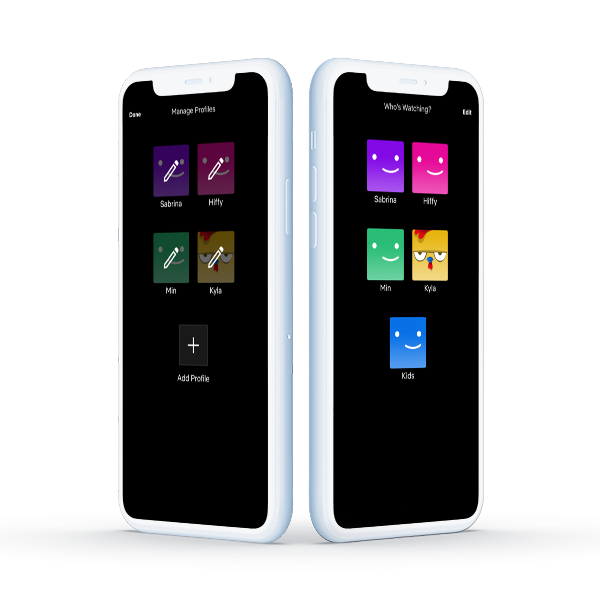
A heuristic analysis of the process for users to add a new profile on the Netflix mobile app
A heuristic analysis of the process for users to add a new profile on the Netflix mobile app
I was looking to benchmark an app that customizes content for different people but on one account. This also means that the app allows one account to have multiple profiles.
Netflix came to mind first. I decided to do a heuristic review of Netflix’s process of adding Profiles.
Here you’ll see each of the screens required to add a profile on the Netflix app and my analysis of what they did well (on the right), what needs improvement (on the left), and recommendations are at the bottom of the screen.
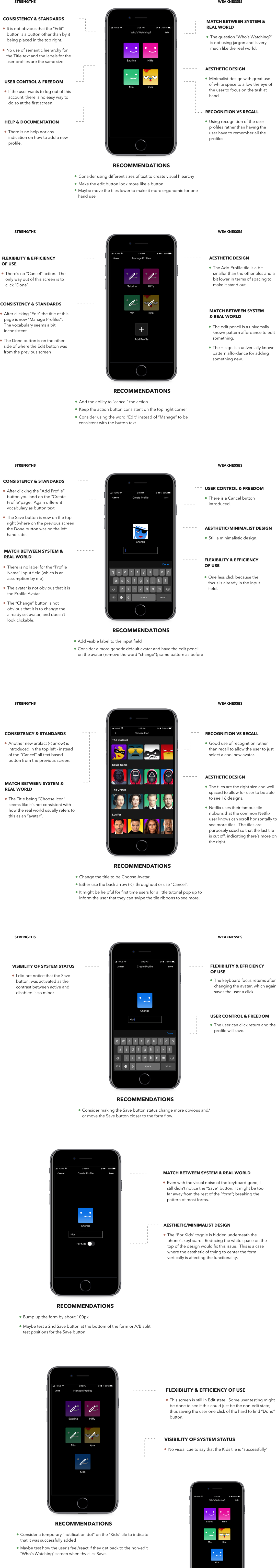
Prior to doing this analysis, I thought of Netflix as the benchmark of design and consistency.
It was surprising to spot so many inconsistencies between each page especially when there isn’t much on each page. The fragmentation could be from the differences of each developer and designer the designed and coded each page.
Although there does seem to be some semblance of a Design System, the inconsistencies in terms of button placement can cause confusion to the user, especially users that are easily disoriented or have cognitive disabilities.